mightySlider is a jQuery plugin for
creating advanced one-directional slider with item based
navigation support.
It can be used as a simple image slider, slideshow, HTML
content slider, gallery, banner rotator, video gallery,
carousel or even presentation. This is achieved by a
powerful & developer friendly API that provides a bunch
of very useful methods giving you control over
everything.
Installation
First make sure the HTML5 doctype is set as the very first
line on the page:
<!DOCTYPE html>
Include jQuery 1.7 or above in the header. Going with
the latest 1.10.x release is recommended for optimal
performance, the Google CDN can be used to include this
file.
Download
mightySlider and upload the files from
the package to your server. Include
mightyslider.min.js below jQuery. Also include
mightyslider.css and make sure the include
paths point to the locations where the files have been
uploaded.
<!-- Plugin requires jQuery 1.7+  -->
<!-- If you already have jQuery on your page, you shouldn't include it second time. -->
<script type="text/javascript" src="https://ajax.googleapis.com/ajax/libs/jquery/1.10.2/jquery.min.js"></script>
<!-- Main slider JS script file -->
<script type="text/javascript" src="mightyslider/src/js/mightyslider.min.js"></script>

<!-- basic stylesheet with skins imported -->
<link rel="stylesheet" type="text/css" href="mightyslider/src/css/mightyslider.css"/>
That's it! mightySlider should now be
ready for use.
Tip:
Gzipping helps reduce the total
filesize to just 19kb.
Usage
Markup
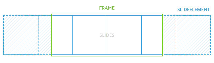
Terminology:
mightySlider is being applied to a
FRAME. SLIDEELEMENT is a
first child of a FRAME. The slides are
then inside of a SLIDEELEMENT.
Every child element will be treated as a slide.
Type of tag doesn't matter, it can be an unordered
list, just list of divs, whatever. You can learn more about
slide types in next sections of documentation.
Initialize the slider (usually at the end of the
body tag. For slider settings, check options section.
The alternative is using the Javascript API. See the
API documentation for more
on it, this section will cover just the HTML approach.
<script>
  jQuery(document).ready(function($) {
    $(".frame").mightySlider({
      // options go here
      // as an example, enable keyboard arrows nav by 'slides'
      navigation: {
        keyboardNavBy: 'slides'
      }
    });
  });
</script>
Apply size to slider parent via CSS (optional). If you
want slider to scale height based on width, take a look at
the autoScale option.
mightySlider attempts to automatically
detect the media type of the slides. The type can also be
set to one of the following values using the
type option in
SLIDES Options:
image, flash, video
or iframe.
Image
Most of the time setting the type will not be
required, it will be detected with cover
option:
mightySlider has this feature
to set covers from URL with all available options
and automatically configure them for the slides.
Here's an example of it:
flickr.com, 500px.com,
instagram.com, vimeo.com,
deviantart.com,
youtube.com and
dailymotion.com
Flash
Swf files can be embedded by using
flash as the type. Some extra options are
available for this type. flashvars can be
used to set flashvars as key/value pairs. The following
example embeds a video through flash using JWPlayer, it uses flashvars to configure
the player:
Video files can be embedded by using
video as the type. Most of the time
setting the type will not be required, it will be
detected with video, mp4,
webm or ogv option:
MediaElement.jsmediaelementjs.php and JW
Playerjwplayer.php.
Embedding
The following examples are best practices for embedding
third party content.
Youtube
Youtube provides HTML5 support by embedding videos
through iframes. It's recommended to use this so that
video will work on mobile devices without Flash support
(iPhone/iPad). Here's an example of a Youtube
<iframe> embed based on the Youtube Player API.
mightySlider has this feature to
parse videos from URL with all available options and
automatically configure them for the slides, this
feature available for covers too. Here's an example of
it:
Video covers are not supported in touch devices so you need to set poster option also for inserting image cover slide instead of the video like above example.
Multiple Covers
Sets custom multiple covers using array and media queries.
In this case when window width is 400px or lower MAX400PX_PATH.JPG image will show and when
window width is 1200px or lower MAX1200PX_PATH.JPG image will show:
Sets the cover image resizing method used to fit
content within the viewport. Possible values
are: fill, fit,
stretch and
center, the default is fill.
Value
Description
fill
Scale the cover image to be as large as possible so that the SLIDE area is completely covered by the cover image. Some parts of the cover image may not be in view within the SLIDE positioning area.
fit
Scale the cover image to the largest size such that only its width or its height can fit inside the SLIDE content area.
stretch
Scale the cover image to the largest size such that both its width and its height can fit inside the SLIDE content area.
center
Allows the cover image be at its original size and in center.
Sets a thumbnail image for use with the
thumbnail controls. SLIDES have a thumbnail
based on their cover source image by default, this
option can be used to set an alternative. For
every other type this option will have to be
set to generate a thumbnail:
By default, everything is disabled. Initiating mightySlider with all default options will leave you with a dead FRAME that doesn't do anything.
Quick reference
mightySlider call with all default options as defined in the source.
var frame = new mightySlider('#frame', {
  // Mixed options
  moveBy:       300,        // Speed in pixels per second used by forward and backward buttons.
  speed:        300,        // Animations speed in milliseconds. 0 to disable animations.
  easing:       'swing',    // Easing for duration based (tweening) animations.
  startAt:      0,          // Starting offset in slides.
  startRandom:  0,          // Starting offset in slides randomly, where: 1 = random, 0 = disable.
  viewport:     'fill',     // Sets the cover image resizing method used to fit content within the viewport. Can be: 'center', 'fit', 'fill', 'stretch'.
  autoScale:    0,          // Automatically updates slider height based on base width.
  autoResize:   0,          // Auto resize the slider when active slide is bigger than slider FRAME.
  videoFrame:   null,       // The URL of the video frame to play videos with your custom player.
  preloadMode:  'nearby',   // Preloading mode for slides covers. Can be: 'all', 'nearby', 'instant'.

  // Navigation
  navigation: {
    horizontal:      1,               // Switch to horizontal mode.
    navigationType:  'forceCentered', // Slide navigation type. Can be: 'basic', 'centered', 'forceCentered'.
    slideSelector:   null,            // Select only slides that match this selector.
    smart:           1,               // Repositions the activated slide to help with further navigation.
    activateOn:      null,            // Activate an slide on this event. Can be: 'click', 'mouseenter', ...
    activateMiddle:  1,               // Always activate the slide in the middle of the FRAME. forceCentered only.
    slideSize:       0,               // Sets the slides size. Can be: Fixed(500) or Percent('100%') number.
    keyboardNavBy:   null             // Enable keyboard navigation by 'slides' or 'pages'.
  },

  // Deep-Linking
  deeplinking: {
    linkID:     null, // Sets the deeplinking id.
    separator:  '/',  // Separator between linkID and slide ID.
    scrollTo:   0     // Enable scroll to slider when link changed.
  },

  // Scrolling
  scrolling: {
    scrollSource: null, // Selector or DOM element for catching the mouse wheel scrolling. Default is FRAME.
    scrollBy:     0,    // Slides to move per one mouse scroll. 0 to disable scrolling.
    hijack:       300   // Milliseconds since last wheel event after which it is acceptable to hijack global scroll.
  },

  // Dragging
  dragging: {
    dragSource:    null, // Selector or DOM element for catching dragging events. Default is FRAME.
    mouseDragging: 1,    // Enable navigation by dragging the slideElement with mouse cursor.
    touchDragging: 1,    // Enable navigation by dragging the slideElement with touch events.
    releaseSwing:  1,    // Ease out on dragging swing release.
    swingSync:     7.5,  // Swing synchronization.
    swingSpeed:    0.1,  // Swing synchronization speed, where: 1 = instant, 0 = infinite.
    elasticBounds: 1,    // Stretch slideElement position limits when dragging past FRAME boundaries.
    syncSpeed:     0.5,  // slideElement synchronization speed, where: 1 = instant, 0 = infinite.
    onePage:       0,    // Enable one page move per drag, where: 1 = enable, 0 = disable.
    interactive:   null  // Selector for special interactive elements.
  },

  // Scrollbar
  scrollBar: {
    scrollBarSource: null, // Selector or DOM element for scrollbar container.
    dragHandle:      1,    // Whether the scrollbar handle should be draggable.
    dynamicHandle:   1,    // Scrollbar handle represents the ratio between hidden and visible content.
    minHandleSize:   50,   // Minimal height or width (depends on mightySlider direction) of a handle in pixels.
    clickBar:        1     // Enable navigation by clicking on scrollbar.
  },

  // Pages
  pages: {
    pagesBar:       null, // Selector or DOM element for pages bar container.
    activateOn:     null, // Event used to activate page. Can be: click, mouseenter, ...
    pageBuilder:          // Page item generator.
      function (index) {
        return '<li>' + (index + 1) + '</li>';
      }
  },

  // Thumbnails
  thumbnails: {
    thumbnailsBar:       null,    // Selector or DOM element for thumbnails bar container.
    horizontal:          1,       // Switch to horizontal mode.
    preloadThumbnails:   1,       // Enable preload thumbnails images.
    thumbnailNav:        'basic', // Thumbnail navigation type. Can be: 'basic', 'centered', 'forceCentered'.
    activateOn:          'click', // Event used to activate thumbnail. Can be: click, mouseenter, ...
    scrollBy:            1,       // Thumbnails to move per one mouse scroll. 0 to disable scrolling.
    mouseDragging:       1,       // Enable navigation by dragging the thumbnailsBar with mouse cursor.
    touchDragging:       1,       // Enable navigation by dragging the thumbnailsBar with touch events.
    thumbnailSize:       0,       // Set thumbnails size. Can be: 500 and '100%'.
    thumbnailBuilder:             // Thumbnail item generator.
      function (index, thumbnail) {
        return '<li><img src="' + thumbnail + '" /></li>';
      }
  },

  // Commands
  commands: {
    thumbnails:     0, // Enable thumbnails navigation.
    pages:          0, // Enable pages navigation.
    buttons:        0  // Enable navigation buttons.
  },

  // Navigation buttons
  buttons: {
    forward:    null, // Selector or DOM element for "forward movement" button.
    backward:   null, // Selector or DOM element for "backward movement" button.
    prev:       null, // Selector or DOM element for "previous slide" button.
    next:       null, // Selector or DOM element for "next slide" button.
    prevPage:   null, // Selector or DOM element for "previous page" button.
    nextPage:   null, // Selector or DOM element for "next page" button.
    fullScreen: null  // Selector or DOM element for "fullscreen page" button.
  },

  // Automated cycling
  cycling: {
    cycleBy:       null, // Enable automatic cycling by 'slides' or 'pages'.
    pauseTime:     5000, // Delay between cycles in milliseconds.
    loop:          1,    // Repeat cycling when last slide/page is activated.
    pauseOnHover:  0,    // Pause cycling when mouse hovers over the FRAME.
    startPaused:   0     // Whether to start in paused sate.
  },

  // Parallax layers
  parallax: {
    x:                1,              // Move in X axis parallax layers. where: 1 = enable, 0 = disable.
    y:                1,              // Move in Y axis parallax layers. where: 1 = enable, 0 = disable.
    z:                0,              // Move in Z axis parallax layers. where: 1 = enable, 0 = disable.
    scroll:           0,              // Eanbling the scrolling parallax for layers and covers.
    invertX:          1,              // Invert X axis movements. where: 1 = enable, 0 = disable.
    invertY:          1,              // Invert Y axis movements. where: 1 = enable, 0 = disable.
    invertZ:          0,              // Invert Z axis movements. where: 1 = enable, 0 = disable.
    revert:           1,              // Whether the layers should revert to theirs start position when mouse leaved the slider. where: 1 = enable, 0 = disable.
    revertDuration:   1500,           // The duration of the revert animation, in milliseconds.
    revertEasing:     'easeOutExpo',  // Easing for revert duration based (tweening) animations.
    frictionDuration: 1500,           // The duration of the friction the layers experience. 0 to disable friction.
    frictionEasing:   'easeOutExpo'   // Easing for friction duration based (tweening) animations.
  },

  // Classes
  classes: {
    isTouchClass:        'isTouch',        // Class for when device has touch ability.
    draggedClass:        'dragged',        // Class for dragged slideElement.
    activeClass:         'active',         // Class for active slides and pages.
    disabledClass:       'disabled',       // Class for disabled navigation elements.
    verticalClass:       'vertical',       // Class for vertical sliding mode.
    horizontalClass:     'horizontal',     // Class for horizontal sliding mode.
    showedLayersClass:   'showed',         // Class for showed layers.
    isInFullScreen:      'isInFullScreen'  // Class for when slider is in fullscreen
  }
});
moveBynumberDefault: 300
Speed in pixels per second used by forward and backward buttons.
moveBy: 200
speednumberDefault: 300
Animations speed in milliseconds. 0 to disable animations.
speed: 800
easingstringDefault: swing
Easing function for duration based (tweening) animations. Default build in functions are linear & swing. For more, install the jQuery Easing Plugin.
Sets the cover image resizing method used to fit
content within the viewport. Possible values
are: fill, fit,
stretch and
center.
Value
Description
fill
Scale the cover image to be as large as possible so that the SLIDE area is completely covered by the cover image. Some parts of the cover image may not be in view within the SLIDE positioning area.
fit
Scale the cover image to the largest size such that only its width or its height can fit inside the SLIDE content area.
stretch
Scale the cover image to the largest size such that both its width and its height can fit inside the SLIDE content area.
center
Allows the cover image be at its original size and in center.
viewport: 'fit'
autoScalebooleanDefault: false
Automatically updates slider height based on base width.
autoScale: 1
autoResizebooleanDefault: false
Auto resize the slider when active slide is bigger than slider FRAME.
autoResize: 1
videoFramestringDefault: null
The URL of the video frame to play videos with your custom player.
videoFrame: 'src/videoframes/mediaelementjs.php'
Video Frames:
MediaElement.jsmediaelementjs.php and JW
Playerjwplayer.php.
preloadModestringDefault: nearby
Preloading mode for slides covers. Possible values
are: all, nearby and
instant.
Value
Description
all
Preload all slides covers.
nearby
Preload visible and nearby slides covers.
instant
Preload just visible slides covers.
preloadMode: 'all'
navigationobject
Sets the slider navigation options.
navigation: {
  horizontal:      1,               // Switch to horizontal mode.
  navigationType:  'forceCentered', // Slide navigation type. Can be: 'basic', 'centered', 'forceCentered'.
  slideSelector:   null,            // Select only slides that match this selector.
  smart:           1,               // Repositions the activated slide to help with further navigation.
  activateOn:      null,            // Activate an slide on this event. Can be: 'click', 'mouseenter', ...
  activateMiddle:  1,               // Always activate the slide in the middle of the FRAME. forceCentered only.
  slideSize:       0,               // Sets the slides size. Can be: Fixed(500) or Percent('100%') number.
  keyboardNavBy:   null             // Enable keyboard navigation by 'slides' or 'pages'.
}
horizontalbooleanDefault: true
Switches to horizontal mode.
navigation: {
  horizontal: 0
}
navigationTypestringDefault: forceCentered
This option sets the SLIDE navigation type. Possible values are: basic, centered and forceCentered.
Value
Description
basic
Slides snap to FRAME edges.
centered
Activated slide, or slide that happens to be in the middle are positioned to the center of a visible FRAME when possible. "When possible" means that the first or last slides wont detach SLIDEELEMENT from the FRAME edges, thus they will remain at the start or end of the visible FRAME.
forceCentered
Same as centered, without the "when possible" part. All slides, even first and last ones can be positioned to the center of the FRAME when they are activated, or just moved there.
navigation: {
  navigationType: 'basic'
}
slideSelectorstringDefault: null
Select only slides that match this selector. It only makes sense to use a selector that will select only visible slides. If you'll select only some slides, but leave others visible, the slide navigation won't work properly.
navigation: {
  slideSelector: '.even'
}
This example will select only slides that have even class.
smartbooleanDefault: true
Enables smart navigation. Smart navigation will re-position the activated item to help with further navigation. For example, in basic navigation type, when last visible item is activated, mightySlider will animate it to the start of the FRAME, as it assumes that user is moving forward.
In centered navigation types, all activated slides are positioned to the center of the frame.
navigation: {
  smart: 0
}
activateOnstringDefault: null
Event name. When an slide will receive this event, it will be activated. You'll mostly want to set it to click. Leave null to disable activating slides by user interaction.
navigation: {
  activateOn: 'click'
}
activateMiddlebooleanDefault: true
This will automatically activate a slide that happens to be in the middle of the visible FRAME. This option is available only for forceCentered navigation type.
navigation: {
  activateMiddle: 0
}
slideSizenumberstringDefault: 0
Sets the slides size. Can be: Fixed(500) or Percent('100%') number.
navigation: {
  slideSize: '80%'
}
navigation: {
  slideSize: 300   // 300px
}
Note:
This option will
set the slides width in horizontal navigation mode or
height in vertical navigation mode.
keyboardNavBystringDefault: null
Enable keyboard navigation. Possible values are: slides and pages.
Value
Description
slides
Navigate by slides.
pages
Navigate by pages.
navigation: {
  keyboardNavBy: 'slides'
}
deeplinkingobject
Sets the slider deep linking options.
deeplinking: {
  linkID:     null, // Sets the deeplinking id.
  separator:  '/',  // Separator between linkID and slide ID.
  scrollTo:   0     // Enable scroll to slider when link changed.
}
linkIDstringDefault: null
Slider linking name. Name that will be added to hash. For example if you set it to gallery, hash would look like this: #gallery/5.
deeplinking: {
  linkID: 'gallery'
}
separatorstringDefault: /
Separator between linkID and slide ID. Separator that will be added to hash. For example if you set it to -, hash would look like this: #gallery-5.
scrolling: {
  scrollSource: null, // Selector or DOM element for catching the mouse wheel scrolling. Default is FRAME.
  scrollBy:     0,    // Slides to move per one mouse scroll. 0 to disable scrolling.
  hijack:       300   // Milliseconds since last wheel event after which it is acceptable to hijack global scroll.
}
Number of slides to move per one mouse wheel scroll event. Leave at 0 to disable.
scrolling: {
  scrollBy: 1
}
hijacknumberDefault: 300
Milliseconds since last wheel event after which it is acceptable to hijack global scroll.
scrolling: {
  hijack: 500
}
draggingobject
Sets the slider mouse and touch dragging options.
Dragging can't be initiated by interactive elements. By default, mightySlider recognizes input, button, select, or a textarea elements as interactive. You can expand this pool by passing a selector into interactive option described below.
dragging: {
  dragSource:    null, // Selector or DOM element for catching dragging events. Default is FRAME.
  mouseDragging: 1,    // Enable navigation by dragging the slideElement with mouse cursor.
  touchDragging: 1,    // Enable navigation by dragging the slideElement with touch events.
  releaseSwing:  1,    // Ease out on dragging swing release.
  swingSync:     7.5,  // Swing synchronization.
  swingSpeed:    0.1,  // Swing synchronization speed, where: 1 = instant, 0 = infinite.
  elasticBounds: 1,    // Stretch slideElement position limits when dragging past FRAME boundaries.
  syncSpeed:     0.5,  // slideElement synchronization speed, where: 1 = instant, 0 = infinite.
  onePage:       0,    // Enable one page move per drag, where: 1 = enable, 0 = disable.
  interactive:   null  // Selector for special interactive elements.
}
Enables navigation by dragging the FRAME content with mouse cursor.
dragging: {
  mouseDragging: 0
}
touchDraggingbooleanDefault: true
Enables navigation by dragging the FRAME content with touch events.
dragging: {
  touchDragging: 0
}
releaseSwingbooleanDefault: true
Whether mightySlider should calculate additional easing path for swipe/swing gestures after dragging has been released. The path length is calculated by the swing strength, i.e. the path that pointer moved in the last 40ms.
dragging: {
  releaseSwing: 0
}
swingSyncfloatDefault: 7.5
This specifies the release swing synchronization.
dragging: {
  swingSync: 2.5
}
swingSpeedfloatDefault: 0.1
This specifies the release swing animation speed. For this animation mightySlider uses non-duration based easing function that accepts synchronization factor instead of milliseconds. That means:
1 = Immediate, no animation 0 = Infinitely long animation
dragging: {
  swingSpeed: 0.15
}
elasticBoundsbooleanDefault: true
Whether to stretch SLIDEELEMENT position limits when dragging past FRAME boundaries.
dragging: {
  elasticBounds: 0
}
syncSpeedfloatDefault: 0.5
When dragging the handle, this represents the synchronization animation speed. For this animation mightySlider uses non-duration based easing function that accepts synchronization factor instead of milliseconds. That means:
1 = Immediate, no animation 0 = Infinitely long animation
By default, 0.5 means that the synchronization will take 2-3 animation frames, enough for it to feel super responsive and smooth without the choppiness. Set it lower for lazy synchronization feel.
dragging: {
  syncSpeed: 0.3
}
onePagebooleanDefault: false
Enable one page move per drag.
dragging: {
  onePage: 1
}
interactivestringDefault: null
Selector for elements that should be treated as interactive. Interactive elements don't initiate dragging. By default, mightySlider recognizes input, button, select, or a textarea elements as interactive. You can expand this pool by passing a selector into this option.
Sets the slider scrollbar navigation control options.
scrollBar: {
  scrollBarSource: null, // Selector or DOM element for scrollbar container.
  dragHandle:      1,    // Whether the scrollbar handle should be draggable.
  dynamicHandle:   1,    // Scrollbar handle represents the ratio between hidden and visible content.
  minHandleSize:   50,   // Minimal height or width (depends on mightySlider direction) of a handle in pixels.
  clickBar:        1     // Enable navigation by clicking on scrollbar.
}
Scrollbar handle represents the ratio between hidden and visible content.
scrollBar: {
  dynamicHandle: 0
}
minHandleSizenumberDefault: 50
Minimal height or width (depends on mightySlider direction) of a handle in pixels.
scrollBar: {
  minHandleSize: 30
}
clickBarbooleanDefault: true
Enable/disable navigation by clicking on scrollbar.
scrollBar: {
  clickBar: 0
}
pagesobject
Sets the slider pagesbar navigation control options.
pages: {
  pagesBar:       null, // Selector or DOM element for pages bar container.
  activateOn:     null, // Event used to activate page. Can be: click, mouseenter, ...
  pageBuilder:          // Page item generator.
    function (index) {
      return '<li>' + (index + 1) + '</li>';
    }
}
Event name. When a page item receives this event, the corresponding page will be activated. You'll mostly want to set it to click. Leave null to disable activating pages by user interaction.
pages: {
  activateOn: 'click'
}
pageBuilderfunctionDefault: fn
A function that returns an HTML for one page item. This function accepts page index (starting at 0) as its first argument, and receives the current mightySlider instance object as its this value. The default function looks like this:
Sets the slider thumbnails bar navigation control options.
thumbnails: {
  thumbnailsBar:       null,    // Selector or DOM element for thumbnails bar container.
  horizontal:          1,       // Switch to horizontal mode.
  preloadThumbnails:   1,       // Enable preload thumbnails images.
  thumbnailNav:        'basic', // Thumbnail navigation type. Can be: 'basic', 'centered', 'forceCentered'.
  activateOn:          'click', // Event used to activate thumbnail. Can be: click, mouseenter, ...
  scrollBy:            1,       // Thumbnails to move per one mouse scroll. 0 to disable scrolling.
  mouseDragging:       1,       // Enable navigation by dragging the thumbnailsBar with mouse cursor.
  touchDragging:       1,       // Enable navigation by dragging the thumbnailsBar with touch events.
  thumbnailSize:       0,       // Set thumbnails size. Can be: 500 and '100%'.
  thumbnailBuilder:             // Thumbnail item generator.
    function (index, thumbnail) {
      return '<li><img src="' + thumbnail + '" /></li>';
    }
}
Enable preload thumbnails images. You should disable this option when you want to use thumbnails as tabs.
thumbnails: {
  preloadThumbnails: 0
}
thumbnailNavstringDefault: basic
This option sets the thumbnails navigation type. Possible values are: basic, centered and forceCentered.
Value
Description
basic
Thumbnail items snap to thumbnails bar edges.
centered
Activated thumbnail, or thumbnail that happens to be in the middle are positioned to the center of a visible thumbnails bar when possible. "When possible" means that the first or last thumbnails wont detach SLIDEELEMENT from the thumbnails bar edges, thus they will remain at the start or end of the visible thumbnails bar.
forceCentered
Same as centered, without the "when possible" part. All slides, even first and last ones can be positioned to the center of the thumbnails bar when they are activated, or just moved there.
thumbnails: {
  thumbnailNav: 'basic'
}
activateOnstringDefault: null
Event name. When a thumbnail item receives this event, the corresponding slide will be activated. You'll mostly want to set it to click. Leave null to disable activating thumbnails by user interaction.
thumbnails: {
  activateOn: 'click'
}
scrollBynumberDefault: 1
Number of thumbnail items to move per one mouse wheel scroll event. Leave at 0 to disable.
thumbnails: {
  scrollBy: 0
}
mouseDraggingbooleanDefault: true
Enables navigation by dragging the thumbnails bar content with mouse cursor.
thumbnails: {
  mouseDragging: 0
}
touchDraggingbooleanDefault: true
Enables navigation by dragging the thumbnails bar content with touch events.
thumbnails: {
  touchDragging: 0
}
thumbnailSizenumberstringDefault: 0
Sets the thumbnail items size. Can be: Fixed(500) or Percent('100%') number.
thumbnails: {
  thumbnailSize: '80%'
}
thumbnails: {
  thumbnailSize: 300   // 300px
}
Note:
This option will
set the thumbnail items width in thumbnails bar horizontal navigation mode or
height in vertical navigation mode.
thumbnailBuilderfunctionDefault: fn
A function that returns an HTML for one thumbnail item. This function accepts thumbnail index (starting at 0) as its first argument and thumbnail URL as its second argument, and receives the current mightySlider instance object as its this value. The default function looks like this:
Sets the slider navigation buttons. All of the navigation button options are essentially just a convenience features, and could be easily replicated by methods.
buttons: {
  forward:    null, // Selector or DOM element for "forward movement" button.
  backward:   null, // Selector or DOM element for "backward movement" button.
  prev:       null, // Selector or DOM element for "previous slide" button.
  next:       null, // Selector or DOM element for "next slide" button.
  prevPage:   null, // Selector or DOM element for "previous page" button.
  nextPage:   null, // Selector or DOM element for "next page" button.
  fullScreen: null  // Selector or DOM element for "fullscreen page" button.
}
Selector string, DOM element, or a jQuery object with element for fullscreen button.
buttons: {
  fullScreen: '#fullScreenButton'
}
cyclingobject
Sets the slider automated cycling.
cycling: {
  cycleBy:       null, // Enable automatic cycling by 'slides' or 'pages'.
  pauseTime:     5000, // Delay between cycles in milliseconds.
  loop:          1,    // Repeat cycling when last slide/page is activated.
  pauseOnHover:  0,    // Pause cycling when mouse hovers over the FRAME.
  startPaused:   0     // Whether to start in paused sate.
}
cycleBystringDefault: null
Activates automated cycling. Possible values are: slides and pages.
Value
Description
slides
Cycling by slides.
pages
Cycling by pages.
cycling: {
  cycleBy: 'pages'
}
pauseTimenumberDefault: 5000
Delay between cycles in milliseconds.
cycling: {
  pauseTime: 'pages'
}
loopbooleanDefault: true
Repeat cycling when last slide/page is activated.
cycling: {
  loop: 0
}
pauseOnHoverbooleanDefault: false
Whether to pause the cycling while the mouse is hovering over the FRAME.
cycling: {
  pauseOnHover: 1
}
startPausedbooleanDefault: false
When cycleBy is enabled, this will start the mightySlider in paused mode.
cycling: {
  startPaused: 1
}
parallaxobject
Sets the slider parallax layers options.
parallax: {
  x:                1,              // Move in X axis parallax layers. where: 1 = enable, 0 = disable.
  y:                1,              // Move in Y axis parallax layers. where: 1 = enable, 0 = disable.
  z:                0,              // Move in Z axis parallax layers. where: 1 = enable, 0 = disable.
  scroll:           0,              // Eanbling the scrolling parallax for layers and covers.
  invertX:          1,              // Invert X axis movements. where: 1 = enable, 0 = disable.
  invertY:          1,              // Invert Y axis movements. where: 1 = enable, 0 = disable.
  invertZ:          1,              // Invert Z axis movements. where: 1 = enable, 0 = disable.
  revert:           1,              // Whether the layers should revert to theirs start position when mouse leaved the slider. where: 1 = enable, 0 = disable.
  revertDuration:   1500,           // The duration of the revert animation, in milliseconds.
  revertEasing:     'easeOutExpo',  // Easing for revert duration based (tweening) animations.
  frictionDuration: 1500,           // The duration of the friction the layers experience. 0 to disable friction.
  frictionEasing:   'easeOutExpo'   // Easing for friction duration based (tweening) animations.
}
xbooleanDefault: true
Enable/disable move in X axis parallax layers.
parallax: {
  x: 0
}
ybooleanDefault: true
Enable/disable move in Y axis parallax layers.
parallax: {
  y: 0
}
zbooleanDefault: false
Enable/disable move in Z axis parallax layers.
parallax: {
  z: 1
}
scrollbooleanDefault: false
Eanbling the scrolling parallax for layers and covers.
parallax: {
  scroll: 1
}
invertXbooleanDefault: true
Enable/disable invert X axis movements.
parallax: {
  invertX: 0
}
invertYbooleanDefault: true
Enable/disable invert Y axis movements.
parallax: {
  invertY: 0
}
invertZbooleanDefault: false
Enable/disable invert Z axis movements.
parallax: {
  invertZ: 1
}
revertbooleanDefault: true
Whether the layers should revert to theirs start position when mouse leaved the slider.
parallax: {
  revert: 0
}
revertDurationnumberDefault: 1500
The duration of the revert animation, in milliseconds.
parallax: {
  revertDuration: 500
}
revertEasingstringDefault: 'easeOutExpo'
Easing for revert duration based (tweening) animations.
parallax: {
  revertEasing: 'easeOutSine'
}
frictionDurationnumberDefault: 1500
The duration of the friction the layers experience. 0 to disable friction.
parallax: {
  frictionDuration: 500
}
frictionEasingstringDefault: 'easeOutExpo'
Easing for friction duration based (tweening) animations.
parallax: {
  frictionEasing: 'easeOutSine'
}
classesobject
Class names used on various elements to mark their state.
classes: {
  isTouchClass:        'isTouch',        // Class for when device has touch ability.
  draggedClass:        'dragged',        // Class for dragged slideElement.
  activeClass:         'active',         // Class for active slides and pages.
  disabledClass:       'disabled',       // Class for disabled navigation elements.
  verticalClass:       'vertical',       // Class for vertical sliding mode.
  horizontalClass:     'horizontal',     // Class for horizontal sliding mode.
  showedLayersClass:   'showed',         // Class for showed layers.
  isInFullScreen:      'isInFullScreen'  // Class for when slider is in fullscreen.
}
isTouchClassstringDefault: isTouch
Class added to PARENT when device has touch ability.
classes: {
  isTouchClass: 'isTouch'
}
draggedClassstringDefault: dragged
Class added to SLIDEELEMENT when being dragged.
activeClassstringDefault: active
Class added to the active slide, thumbnail or page..
disabledClassstringDefault: disabled
Class added to buttons when they are disabled.
Buttons are being disabled when there would be no action after pressing them. For example: the previous item button when the very first item is activated.
If a button is a <button> or <input> element, it will also be marked with disabled="disabled" attribute.
verticalClassstringDefault: vertical
Class added to PARENT in vertical navigation mode.
horizontalClassstringDefault: horizontal
Class added to PARENT in horizontal navigation mode.
showedLayersClassstringDefault: showed
Class added to showed layers.
isInFullScreenstringDefault: isInFullScreen
Class added to PARENT when the slider has been entered to fullscreen.
JavaScript API
The alternative to using the HTML based
approach is using the Javascript API. The API has all
the options of the HTML approach and provides some useful
extra functions that help with customization and
interaction.
Calling
Calling new mightySlider class
When you want to have a direct access to all methods and complete control over mightySlider:
New instance has to be than initiated. That is to give you time to bind callbacks before anything happens. For example, if you want to register callbacks, but don't want to use callbackMap.
The init method returns the very same instance it is called on, so if you are binding callbacks via a callbackMap argument, or not binding callbacks at all, you can initiate the instance right after the new mightySlider call. The slider variable will be the same.
When calling the mightySlider class, the resulting new object exposes some useful properties. These properties are read only, and shouldn't be modified.
Flag of mightySlider initialized state. true when .init() has been called, false otherwise.
slider.optionsobject
Object with all options used by the current mightySlider object. This is essentially a mightySlider.defaults object extended by options passed to new mightySlider().
slider.frameNode
FRAME element DOM node.
slider.slideElementNode
SLIDEELEMENT element DOM node.
slider.positionobject
mightySlider position object specifying the SLIDEELEMENT positions and boundaries:
{
  "start":       0,     // SLIDEELEMENT start of the frame position.
  "center":      1021,  // SLIDEELEMENT center of the frame position.
  "end":         2042,  // SLIDEELEMENT end of the frame position.
  "current":     1168,  // Current SLIDEELEMENT position.
  "destination": 1168   // When in animation, this is the SLIDEELEMENT destination position.
}
All positions are flipped from negative to positive numbers, so it would be easier to work with them.
For example: SLIDEELEMENT element, when at the end of the frame, has CSS property left equal to -2042px (or translateX(-2042px) in browsers that support it), but in the position object, this is represented by positive number end: 2042. All mightySlider methods than accept the flipped position state, like .slideTo(200) to slide 200 pixels from the start of the FRAME, .slideBy(100) to slide by 100px forwards, .slideBy(-100) to slide by 100px backwards, .moveBy(300) to move 300px per second forwards, .moveBy(-300) to move 300px per second backwards, ...
slider.handlePositionobject
mightySlider handlePosition object specifying the scrollbar handle positions:
{
  "start":       0,     // Handle start of the scrollbar position.
  "center":      225,   // Handle center of the scrollbar position.
  "end":         250,   // Handle end of the scrollbar position.
  "current":     200    // Current scrollbar handle position.
}
slider.relativeobject
mightySlider relatives object:
{
  "firstSlide":       4,    // First at least half visible slide in the FRAME.
  "centerSlide":      6,    // Slide in the middle of the visible FRAME.
  "lastSlide":        7,    // Last at least half visible slide in the FRAME.
  "activeSlide":      0,    // Current active slide.
  "activePage":       1,    // Current active page.
  "slideElementSize": 3212, // SLIDEELEMENT size.
  "frameSize":        1170, // FRAME size.
  "scrollbarSize":    1170, // Scrolbar size.
  "handleSize":       531   // Scrollbar handle size.
}
All relatives are updated on every position change, so they are always current. The relatives are always determined from destination position (position.destination), and never from current position (position.current).
The slide properties in non-slide based navigation (firstSlide, ...) are 0 & irrelevant.
slider.slidesarray
Array of slide objects. Structure:
[
  {
    "element":  DOMNode,     // Slide element DOM node.
    "ID":       151,         // Slide ID for deep linking.
    "start":    0,           // Slide start of the FRAME position.
    "center":   -439,        // Slide center of the FRAME position.
    "end":      -878,        // Slide end of the FRAME position.
    "size":     151,         // Slide size in a correspond mightySlider direction.
    "half":     146,         // The half of the slide size.
    "type":     String,      // Slide content type.
    "options":  Object,      // Options that added to slide via data-mightyslider attribute.
    "layers": [            // Array of slide layers objects.
      {
        "element":   DOMNode, // Layer element DOM node.
        "type":      String,  // Layer content type.
        "options":   Object,  // Options that added to layer via data-mightyslider attribute.
        "animation": Object   // Layer animation frames.
      },
      ...
    ],
    "isParallax":              Boolean,  // If any layers has parallax options
    "hasLayerMediaEnabled":  Boolean   // If any layers has media options
  },
  ...
]
Following the position object flipping rule, the negative sign is flipped for each position property. The slide object properties are than designed to be used like this:
slider.slideTo(slider.slides[6].center); // Animates 7th slide to the center of the FRAME
But this is mostly for mightySlider internals, and is quite redundant as the same can be accomplished by:
By examining the item object in the example, you can see that center and end properties are out of bounds, as they are smaller than slider.position.start, so mightySlider will never animate SLIDEELEMENT to such position (unless you are dragging the content past boundaries and elasticBounds are enabled). If mightySlider would be created with forceCentered navigation type, the slider.position.start would be than equal to -439, which is the center position of the first object, i.e. slider.slides[0].center.
slider.pagesarray
Array with page start positions:
[
  0,    // First page start position.
  1168, // Second page start position.
  2336  // Third page start position.
]
The slider.activatePage(1) is then essentially just a shorthand for slider.slideTo(slider.pages[1]).
slider.thumbnailsarray
Array with page start positions:
[
  "FIRST_THUMBNAIL_IMAGE",   // First slide thumbnail.
  "SECOND_THUMBNAIL_IMAGE",  // Second slide thumbnail.
  "THIRD_THUMBNAIL_IMAGE"    // Third slide thumbnail.
]
slider.isFullScreenboolean
When slider is in fulscreen, this property will be true otherwise is false.
slider.isPausednumber
Pause priority level. When cycling is paused, this value is higher than 0, so it is safe to use it as a truthy value in conditionals:
if (slider.isPaused) {
  ...
}
slider.isFreezedboolean
When slider is freezed, this property will be true otherwise is false.
if (slider.isFreezed) {
  ...
}
slider.progressElapsednumber
Automated cycling progress time elapsed.
if (slider.progressElapsed >= 1500) {
  ...
}
slider.uniqIdstring
Unique ID for every mightySlider instances.
Methods
mightySlider has a bunch of very useful methods that provide almost any functionality required. You can call them directly on a mightySlider object, or (if you're a lame) via a jQuery.fn.mightySlider proxy, like so:
$('#frame').mightySlider('destroy'); // does the same thing
Returns the mightySlider object, so you can do shenanigans like new mightySlider().init().destroy().init().
reload
Recalculates sizes and positions of elements. Call it if any change has happened to FRAME or its content, like things have been appended, removed, or resized.
slider.reload();
slideTo
Animate SLIDEELEMENT to a specific position - offset from the start of a FRAME in pixels. The final position will be adjusted to snap slides to the edge/center of the visible FRAME.
number Number of slides to slide the SLIDEELEMENT by. Negative animates towards the beginning, positive towards the end. The final position will be adjusted to fit within position.start and position.end.
immediate
boolean When true, re-positioning will occur immediately without animation.
toStart
Positions target to the start of a visible FRAME. When no target is passed, the whole SLIDEELEMENT will be used.
mixed It can be an slide index, or an slide DOM element.
immediate
boolean When true, re-positioning will occur immediately without animation.
Examples:
// Universal
slider.toStart(); // Position the whole SLIDEELEMENT to the start
slider.toStart(true); // Position whole SLIDEELEMENT to the start, immediately

// Slide based navigation
slider.toStart(2); // Position 3rd slide in SLIDEELEMENT to the start of a visible FRAME
slider.toStart($slides.eq(1), true); // Position 2nd slide in SLIDEELEMENT to the start, immediately
toCenter
Positions target to the center of a visible FRAME. When no target is passed, the whole SLIDEELEMENT will be used.
Initiates continuous linear movement in the direction and speed specified by speed argument. The movement will continue until the position reaches a limit, or stop method is called.
You can however update any option, and than do slider.destroy().init() to re-initiate mightySlider object, thus rebinding all event listeners, rebuilding pages, ...
add
Adds one or multiple slides to the SLIDEELEMENT end, or a specified position, and than reloads the mightySlider object.
mixed DOM element, DOM node list, array with DOM elements, or HTML string of new slide(s).
position
number The relevant position where the new slide should be placed.
When inserting new slides, you want to use this method as it also
handles the active slide index. For example: when
slider.relative.activeSlide: 8,
and inserting new slide at position 6, the slide 6 will be pushed to
position 7, and slider.relative.activeSlide
will shift to 9.
Examples:
slider.add(document.createElement('li'), 5); // Insert slide at position 5
slider.add([LIElement, LIElement]); // Insert multiple slides at the end of SLIDEELEMENT
slider.add('<li data-mightyslider="cover: \'COVER_IMAGE_PATH.JPG\'"></li>', 0); // Insert new slide at the beginning of SLIDEELEMENT
remove
Removes one element from SLIDEELEMENT, and reloads the mightySlider object.
mixed Slide to be positioned. Can be DOM element, or relative slide index.
position
mixed Anchor slide. Can be DOM element, or relative slide index.
Relative index means, that you can pass negative index to select slides from the end of slides list. For example: passing -1 selects the last slide.
Examples:
slider.moveBefore(-1, 0); // Moves the last slide before the first one
slider.moveBefore(-2, 5); // Moves the second to last slide before the 6th slide
on
Registers a callback to one or more of the mightySlider events. All available events and arguments they receive can be found in the Events documentation.
mixed Can be a slide index, or a slide DOM element.
The slide object looks like this:
{
    "element":  DOMNode,  // Slide element DOM node.
    "ID":       151,      // Slide ID for deep linking.
    "start":    0,        // Start position inside of the FRAME.
    "center":   -439,     // Center position inside of the FRAME.
    "end":      -878,     // End position inside of the FRAME.
    "size":     151,      // Size in the current mightySlider direction.
    "half":     146,      // The half of the slide size.
    "type":     "video",  // Slide content type.
    "options":  Object,   // Options that added to slide via data-mightyslider attribute.
    "layers": [         // Array of slide layers objects.
      {
        "element":   DOMNode, // Layer element DOM node.
        "options":   Object,  // Options that added to layer via data-mightyslider attribute.
        "animation": Object   // Layer animation frames.
      },
      ...
    ]
  }
When slide hasn't been found, returns false.
getIndex
Returns an index of a slide, or -1 when not found.
mixed Can be a slide index, or a slide DOM element.
When you pass an integer to the slide argument, the function will just check whether it is a valid index (fits between 0 and slider.slides.length - 1), and return the very same number, or -1 when invalid.
freeze
Freeze the automated cycling and slider layers animations.
slider.freeze();
unFreeze
Unfreeze & normalize the automated cycling and slider layers animations.
slider.unFreeze();
Events
You can register callbacks to mightySlider events in multiple ways.
Passing in a callbackMap on mightySlider object creation:
var slider = new mightySlider('#frame', options, {
  load: fn,
  move: [fn1, fn2] // Multiple callbacks
}).init();
var slider = new mightySlider('#frame', options);
// Register a callback to multiple events
slider.on('loadmove', function (eventName) {
// ...
});
// Register a callback that will be executed only once
slider.one('load', function (eventName) {
// ...
});
// Initiate mightySlider instance
slider.init();
The this value in all callbacks is the mightySlider object triggering the event. With it you have access to all mightySlider object properties.
First argument
All callbacks receive the event name as the first argument.
slider.on('load', function (eventName) {
  console.log(eventName); // 'load'
  console.log(this.position);  // mightySlider position object
});
Events list:
initialize
Event triggered when slider has been initiated.
Arguments:
Argument
Description
eventName
string Event name.
load
Event triggered on first mightySlider load, and on each reload method call.
Arguments:
Argument
Description
eventName
string Event name.
Note:
The slider.position or
this.position
object in this event also contains an old property, containing the position object as it was before the reload. The position object than looks like this:
Event triggered when new slide has been activated.
Arguments:
Argument
Description
eventName
string Event name.
slideIndex
number Index of activated slide.
activePage
Event triggered when new page has been activated, or mightySlider arrived at it while scrolling.
Arguments:
Argument
Description
eventName
string Event name.
pageIndex
number Index of activated page.
change
Event triggered whenever a new position change has been requested. That means that when you call slideTo it will trigger one change event right before the animation starts.
Arguments:
Argument
Description
eventName
string Event name.
Note:
When dragging SLIDEELEMENT, this event is being triggered on each mouse move, which is quite often.
move
Event triggered on every frame of the animation. Animations are chained to requestAnimationFrame, so the frequency of this event when mightySlider is in animation is 60 FPS.
Arguments:
Argument
Description
eventName
string Event name.
moveStart
Event triggered on start of every animation or dragging.
Arguments:
Argument
Description
eventName
string Event name.
moveEnd
Event triggered on end of every animation or dragging.
Arguments:
Argument
Description
eventName
string Event name.
pause
Triggered when cycling has been paused. That includes pauseOnHover functionality.
Arguments:
Argument
Description
eventName
string Event name.
resume
Triggered when cycling has been resumed.
Arguments:
Argument
Description
eventName
string Event name.
progress
Triggered on each cycle tick.
Arguments:
Argument
Description
eventName
string Event name.
progressNumber
float Number of cycling time progresses. Min: 0, Max: 1
enterFullScreen
Triggered when slider has been entered to fullscreen.
Arguments:
Argument
Description
eventName
string Event name.
exitFullScreen
Triggered when slider has been exited from fullscreen.
Arguments:
Argument
Description
eventName
string Event name.
resize
Event triggered when the slider has been resized.
Arguments:
Argument
Description
eventName
string Event name.
beforeResize
Event triggered before the slider resize.
Arguments:
Argument
Description
eventName
string Event name.
coverLoaded
Event triggered whenever a new cover image/video has been loaded.
Arguments:
Argument
Description
eventName
string Event name.
slideIndex
number Index of cover loaded slide.
beforeCoverLoad
Event triggered before a new cover image/video load.
Arguments:
Argument
Description
eventName
string Event name.
slideIndex
number Index of cover loaded slide.
coverInserted
Event triggered whenever a new cover image/video has been inserted.
Arguments:
Argument
Description
eventName
string Event name.
coverElement
DOM element Inserted cover element.
slideLoad
Event triggered when a slide has been loaded.
Arguments:
Argument
Description
eventName
string Event name.
slideIndex
number Index of loaded slide.
beforeSlideLoad
Event triggered before a slide load.
Arguments:
Argument
Description
eventName
string Event name.
slideIndex
number Index of loaded slide.
mediaGenerated
Event triggered whenever a slide media content has been generated.
Arguments:
Argument
Description
eventName
string Event name.
generatedElement
DOM element Generated media element.
beforeGenerateMedia
Event triggered before a slide media content generate.
Arguments:
Argument
Description
eventName
string Event name.
destroy
Event triggered when slider has been destroyed.
Arguments:
Argument
Description
eventName
string Event name.
Layers
Layers are the static or animated elements that will be appear on activated slides.
HTML
Adding layers with mightySlider is logical and easy!
All elements inside slide that have class .mSCaption will be treated by slider as layers (tag name doesn't matter).
Layers can not be nested, but you can put multiple instances of them into one slide.
<div class="mightySlider mightyslider_windows8_skin">   <!-- PARENT -->
  <div class="frame" data-mightyslider="width: 1170, height: 500">   <!-- FRAME -->
    <ul class="slideelement">   <!-- SLIDEELEMENT -->

      <!-- Two layers in one slide -->
      <li>
        <h2 class="mSCaption">Layer content 1</h2>   <!-- LAYER -->
        <div class="mSCaption">Layer <b>content</b> 2</div>   <!-- LAYER -->
      </li>   <!-- SLIDE -->

      <!-- HTML content + Image as layer -->
      <li>
        HTML content...
        <img class="mSCaption" src="layer-image.jpg" />   <!-- LAYER -->
      </li>   <!-- SLIDE -->

      <!-- Cover image + Layer with HTML title and text -->
      <li data-mightyslider="cover: 'http://500px.com/photo/23718959'">
        <div class="mSCaption">
            <h2>Title</h2>
            <p>Layer text with title and text.</p>
        </div>   <!-- LAYER -->
      </li>   <!-- SLIDE -->
    </ul>
  </div>
</div>
By default layers have position: absolute; and can be positioned with left, right, top or bottom CSS properties.
Options
Layer Options can be set using the
data-mightyslider attribute:
Video covers are not supported in touch devices so you need to set poster option also for inserting image cover LAYER instead of the video like above example.
The mightySlider lets authors control the intermediate steps in a CSS animation sequence by establishing
key-frames (or waypoints) along the animation sequence that must be reached by certain points during the animation for layers.
This gives you more specific control over the intermediate steps of the animation sequence.
For having high-performance animation rendering and more animation effects you need to include the mightySlider's animation engine (tweenlite.js) JS file into your page.
A string indicating which easing function to use for the transition. Default build in functions are linear & swing. For more, install the jQuery Easing Plugin.
The style property allows us to create animation effects on any numeric CSS property.
The only required parameter is a plain object of CSS properties.
This object is similar to the one that can be sent to the jQuery.css() method,
except that the range of properties is more restrictive.
All animated properties should be animated to a single numeric value,
except as noted below; most properties that are non-numeric cannot be animated (For example, width, height, or left can
be animated but background-color and color cannot be, unless the jQuery.Color() plugin is used).
Property values are treated as a number of pixels unless otherwise specified.
The units em and % can be specified where applicable.
The rotate CSS property defines a transformation that moves the element around a fixed point (as specified by the transform-origin property) without deforming it. The amount of movement is defined by the specified angle; if positive, the movement will be clockwise, if negative, it will be counter-clockwise. A rotation by 180° is called point reflection. For get more information refer to this document: https://developer.mozilla.org/en-US/docs/Web/CSS/transform-function#rotate()
The rotateX CSS property defines a transformation that moves the element around the abscissa without deforming it. The amount of movement is defined by the specified angle; if positive, the movement will be clockwise, if negative, it will be counter-clockwise.
The rotateY CSS property defines a transformation that moves the element around the ordinate without deforming it. The amount of movement is defined by the specified angle; if positive, the movement will be clockwise, if negative, it will be counter-clockwise.
The rotateZ CSS property defines a transformation that moves the element around the z-axis without deforming it. The amount of movement is defined by the specified angle; if positive, the movement will be clockwise, if negative, it will be counter-clockwise.
The scale CSS property modify the size of the element. It can either augment or decrease its size and as the amount of scaling is defined by a vector, if can do so more in one direction than in another one. For get more information refer to this document: https://developer.mozilla.org/en-US/docs/Web/CSS/transform-function#scale()
The scaleX CSS property modifies the abscissa of each element point by a constant factor, except if this scale factor is 1, in which case the property is the identity transform. The scaling is not isotropic and the angles of the element are not conserved. For get more information refer to this document: https://developer.mozilla.org/en-US/docs/Web/CSS/transform-function#scaleX()
The scaleY CSS property modifies the ordinate of each element point by a constant factor except if this scale factor is 1, in which case the property is the identity transform. The scaling is not isotropic and the angles of the element are not conserved. For get more information refer to this document: https://developer.mozilla.org/en-US/docs/Web/CSS/transform-function#scaleY()
The scaleZ CSS property modifies the z-coordinate of each element point by a constant facto, except if this scale factor is 1, in which case the property is the identity transform. The scaling is not isotropic and the angles of the element are not conserved. For get more information refer to this document: https://developer.mozilla.org/en-US/docs/Web/CSS/transform-function#scaleZ()
The skew CSS property is a shear mapping, or transvection, distorting each point of an element by a certain angle in each direction. It is done by increasing each coordinate by a value proportionate to the specified angle and to the distance to the origin. The more far from the origin, the more away the point is, the greater will be the value added to it. For get more information refer to this document: https://developer.mozilla.org/en-US/docs/Web/CSS/transform-function#skew()_2
The skewX CSS property is an horizontal shear mapping distorting each point of an element by a certain angle in the horizontal direction. It is done by increasing the abscissa coordinate by a value proportionate to the specified angle and to the distance to the origin. The more far from the origin, the more away the point is, the greater will be the value added to it. For get more information refer to this document: https://developer.mozilla.org/en-US/docs/Web/CSS/transform-function#skewX()
The skewY CSS property is an vertical shear mapping distorting each point of an element by a certain angle in the vertical direction. It is done by increasing the ordinate coordinate by a value proportionate to the specified angle and to the distance to the origin. The more far from the origin, the more away the point is, the greater will be the value added to it. For get more information refer to this document: https://developer.mozilla.org/en-US/docs/Web/CSS/transform-function#skewY()
The transform-origin CSS property lets you modify the origin for transformations of an element. For example, the transform-origin of the rotate property is the centre of rotation. (This property is applied by first translating the element by the negated value of the property, then applying the element's transform, then translating by the property value.) For get more information refer to this document: https://developer.mozilla.org/en-US/docs/Web/CSS/transform-origin
The box-shadow CSS property describes one or more shadow effects as a comma-separated list. It allows casting a drop shadow from the frame of almost any element. If a border-radius is specified on the element with a box shadow, the box shadow takes on the same rounded corners. The z-ordering of multiple box shadows is the same as multiple text shadows (the first specified shadow is on top). For get more information refer to this document: https://developer.mozilla.org/en-US/docs/Web/CSS/box-shadow
The border-radius CSS property allows Web authors to define how rounded border corners are. The curve of each corner is defined using one or two radii, defining its shape: circle or ellipse. For get more information refer to this document: https://developer.mozilla.org/en-US/docs/Web/CSS/border-radius
These examples not working they are just for displaying skins.
Slider Skins
The slider skins are located in src/slider_skins folder. Available skins are: mightyslider_fullscreen_skin, mightyslider_modern_skin, mightyslider_paper_skin and mightyslider_windows8_skin
Carousel Skins
The carousel skins are located in src/carousel_skins folder. Available skins are: mightyslider_carouselCoverFlow_skin, mightyslider_carouselModern_skin and mightyslider_carouselSimple_skin
Tabs Skins
The tabs skins are located in src/tabs_skins folder. Available skins are: mightyslider_tabsBlack_skin, mightyslider_tabsBlackGlass_skin, mightyslider_tabsBlue_skin, mightyslider_tabsCrystal_skin, mightyslider_tabsGreen_skin, mightyslider_tabsGreenGlass_skin, mightyslider_tabsSilver_skin and mightyslider_tabsWhite_skin
FRAME should have no padding in a correspondent mightySlider direction.
SLIDEELEMENT should have no margin in a correspondent mightySlider direction.
In other words, if you enable horizontal mode, FRAME element should have no padding top & bottom, while SLIDEELEMENT should have no margin top & bottom. The same applies in vertical mode, but for left & right margins/padding.
You can apply padding to SLIDEELEMENT, or margins to slides, but do not use any other units than pixels, or you'll bork things.
Notable behaviors
You can go wild with your slides. Each one can be of different size, and have different margins & paddings. mightySlider is smart, and can figure it out :)
When forceCentered slide navigation is used, every slide is considered to be a separate page. That's because pages in this context don't make sense, so mightySlider creates a page button for each slide instead. Also, the nextPage & prevPage methods & buttons in this case do the exact same thing as next & prev methods & buttons.
When margin of a first slide (margin-top for vertical, margin-left for horizontal) is 0, the last margin of last slide is ignored, and SLIDEELEMENT won't go past the last slide border-box. That's so you don't have to fix last slide margins with li:last-child { margin-right: 0; }, or a custom .last-slide class to support older browsers when you want only spaces between slides, but not between first/last slide and a FRAME border.
 IE
6-8
IE
6-8 IE
9+
IE
9+ Chrome
 Firefox
 Safari
 iOS
iOS Android
 WP
WP